Credit Card
Institutions
Resources
JAN 12, 2016
Introducing The New Gemini Activity Feed

Our Original Idea
This past Friday, we launched the second version of our activity feed. We thought now would be a good time to share our thinking behind it, as well as our overall design philosophy at Gemini. From the beginning, our design approach has centered around creating a powerful yet elegant interface that focuses on the core principle of giving you what you need, when you need it. Whether you are an individual or an institution, you will always have relevant information available to you at a glance.
Versions of this exist in many forms around the web, ranging from Facebook-like news feeds all the way to simple email alerts — you have come to expect this type of design from many of the services you use today — and your bitcoin trading platform should be no different. Enter the Gemini Activity Feed, a collapsible feed that is populated with all of your actions and relevant alerts. From the onset, we wanted to avoid stuffing information in the header, hiding it in menus or making information only available on specific pages. In short, the Gemini Activity Feed is an accessible aggregation of relevant user information.
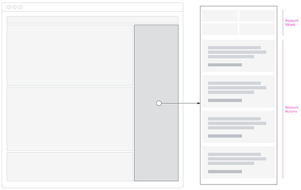
The original structure of the feed involved 1) your account values and 2) your account actions. We designed this feed to be a proof of concept where all actionable items were listed as they happened. Doing it this way gave us the most flexibility and proved to be very useful, however, we quickly found certain items hard to parse, which made the feed at times frustrating to use.
The Evolution
Once we gathered enough customer feedback and understood the pain-points of using the original Gemini Activity Feed, we had clear direction on the improvements we needed to make. On top of that, there were some opportunistic additions that made it into this release.
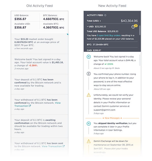
Easier Parsing of Feed Items
Our previous activity feed was text-based, making it very difficult to find or distinguish between say, a placed limit order or a newly created API key. We decided to make a visual distinction between item types so our customers could easily parse them. As a result, we ended up creating branded iconography to help customers differentiate.
Multiple Currency Display (Spoiler Alert!)
Previously, we were locked into only displaying your USD and BTC balances. We reformatted the header area to better accommodate the addition of other (soon to be supported) fiat currencies and cryptocurrencies.
Open Order Notifications
We also wanted to display open orders (i.e., unfilled buy or sell orders). When a limit order is placed but unfulfilled, a notification will now persist in the header of the activity feed. At a glance, the user will know how many open orders they have and how much of their funds are being held.
Naturally, we will continue to see how people engage with their feeds and incorporate customer feedback for future releases. We always welcome input, and are always looking to improve so thanks for all of your input so far!
Onward and Upward,
Marcus Skala
RELATED ARTICLES
MARKETS
APR 30, 2026
Fed Keeps Interest Rates Steady, Bitmine Continues Ethereum Buying, and Bitcoin Call Options Halt Rally
MARKETS
APR 28, 2026
Gemini Predicted: Bitcoin Retreats From $80,000, April CPI Expectations Hit 3.6%, and Crypto High/Low Contracts Are Here
COMPANY
APR 28, 2026
Gemini Releases New Trading Options for Bitcoin Maxis
MORE FROM MARCUS SKALA
COMPANY
DEC 18, 2019